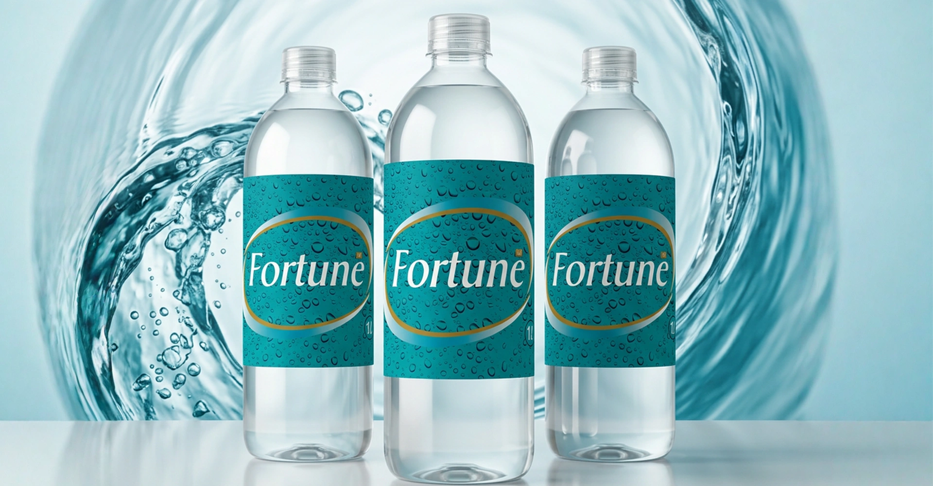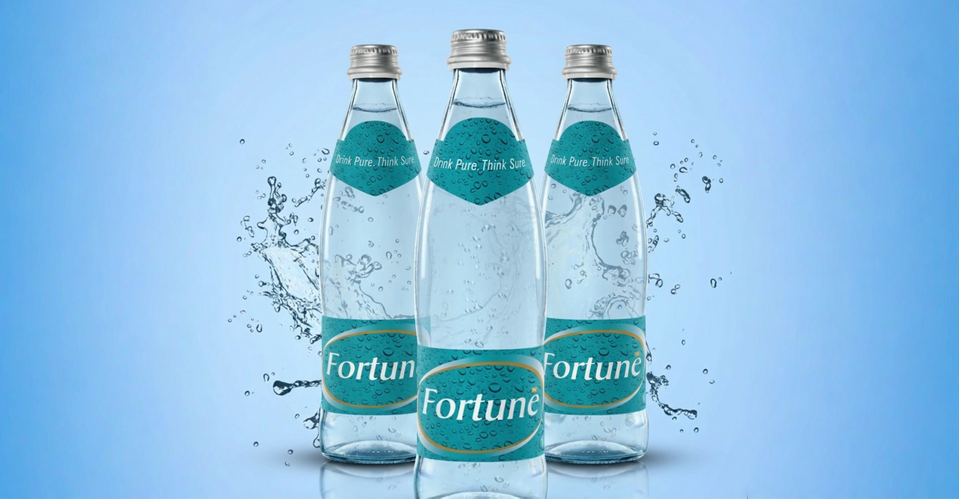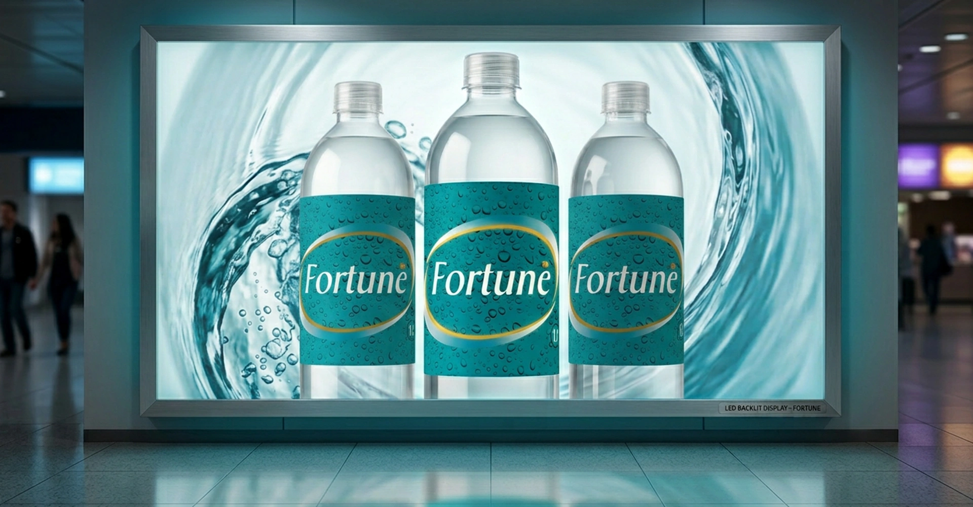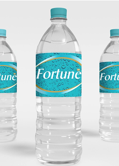
Within the intensely competitive drinking water segment, the label design was crafted to achieve a clear visual distinction, using semiotics that evoke freshness and the act of quenching thirst. The stylised graphic language and distinctive brand colours played a crucial role in establishing the company as a significant player in the marketplace.