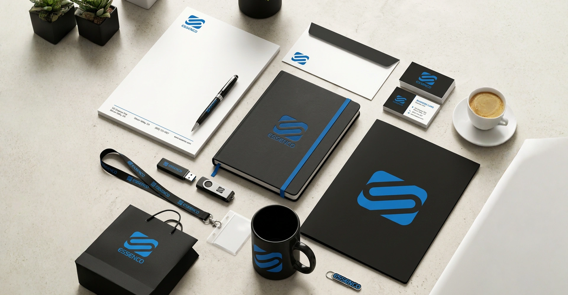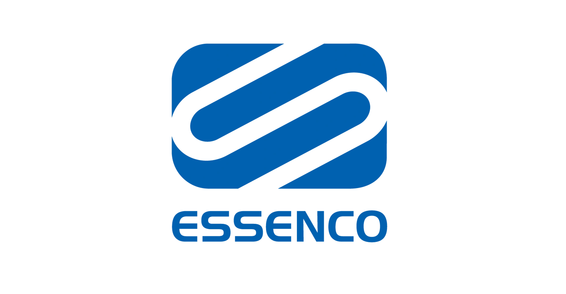
The branding was developed to express the company’s core expertise through a simple yet meaningful visual idea. Extensive discussions and an understanding of the plumbing industry’s functional requirements led to a concept that directly reflected the business itself. The letterform “S” was reimagined as a continuous flowing pipe, symbolising connectivity, precision, reliability, and the uninterrupted flow of water. This unique interpretation created a memorable identity that was both visually distinctive and instantly relevant to the company’s services.
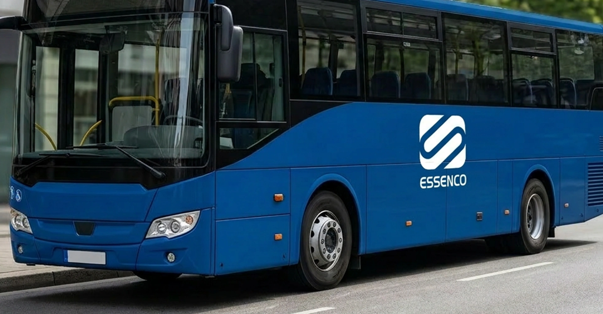
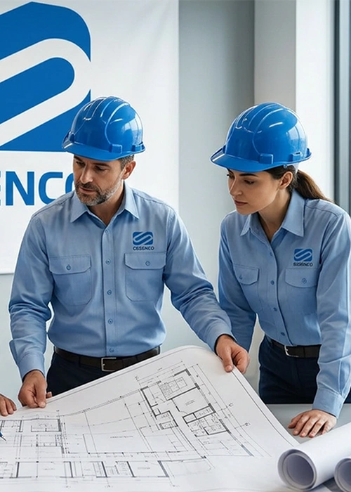
The logo was refined using clean geometric forms to ensure clarity, scalability, and consistent performance across construction sites, vehicles, uniforms, stationery, advertisements, and digital media. Every element of the identity was designed to maximise visibility, recognition, and ease of application while reinforcing the company’s professional image.
The identity has evolved into one of the most recognisable visual symbols within the plumbing industry. Prominently displayed across major construction projects throughout Bangalore, it has built exceptional brand recall, strengthened customer confidence, and enhanced the company’s reputation for quality and reliability. Today, the identity stands as a powerful example of how strategic, industry-specific design can become a valuable long-term business asset.