Triple O was established to provide police officers, doctors, nurses, and other emergency services professionals across Australia with specialised home and vehicle financing solutions. The challenge was to create a distinctive corporate identity that reflected trust, compassion, reliability, and f inancial expertise while acknowledging the brand’s close association with those who dedicate their lives to serving others. The identity needed to be contemporary, memorable, and emotionally engaging.
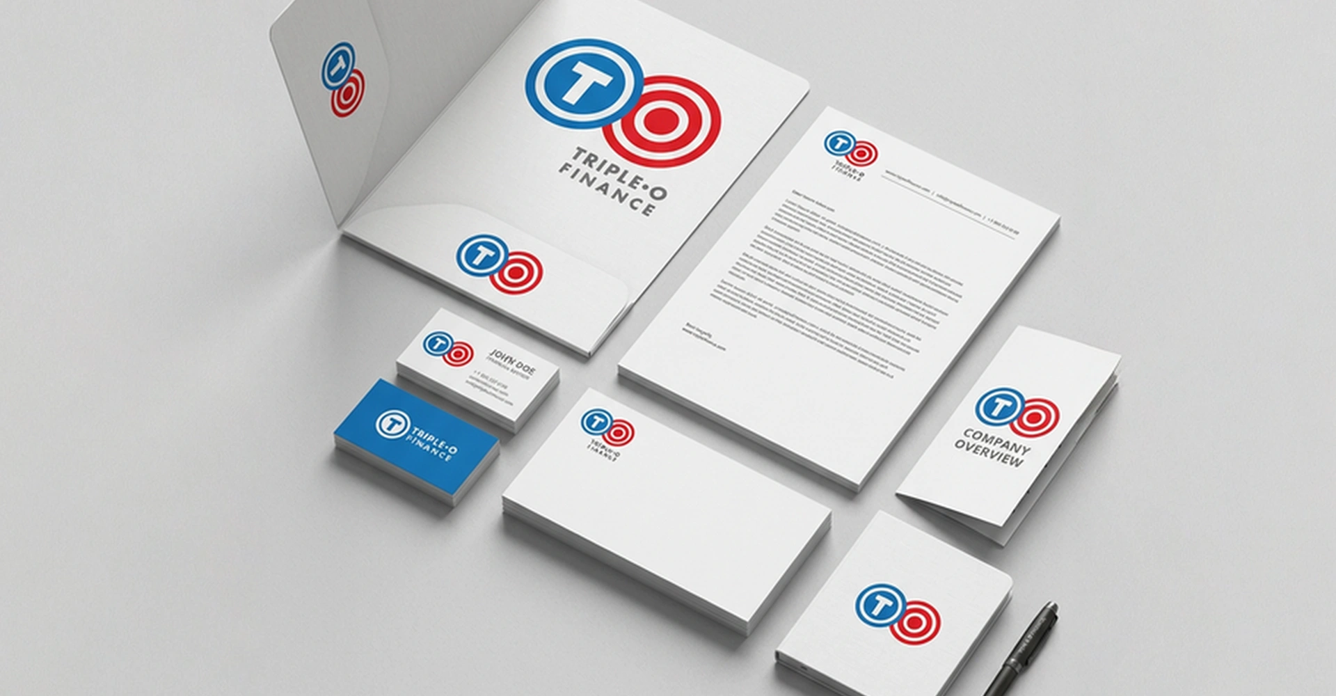
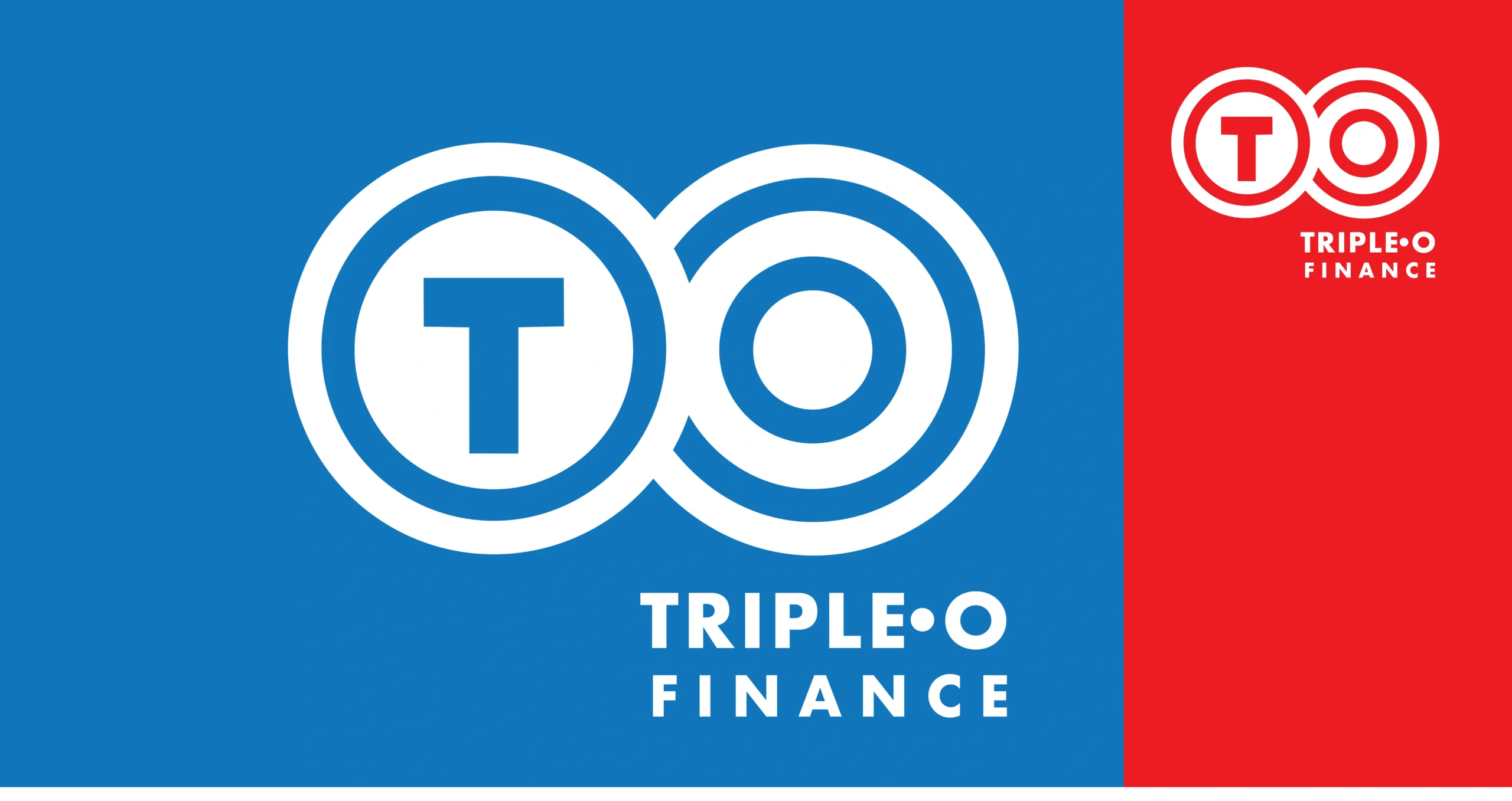
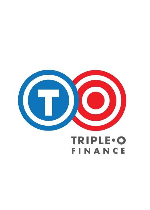
The creative process began with an in-depth understanding of the brand’s mission, target audience, and service values. Multiple concepts were explored before arriving at a unique visual solution built around two interlocking circular forms. The first circle subtly incorporates the letter ‘T’ from Triple, while the second integrates the three ‘O’s, creating a simple yet memorable mnemonic symbol. The continuous circular forms also represent connection, protection, unity, and ongoing support— values central to the brand’s philosophy.
The identity was strengthened through a carefully considered colour palette. A vibrant hue inspired by the emergency services spectrum conveys energy, compassion, and dedication, while Oceanic Blue symbolises care, stability, assurance, and dependability. Steel Grey complements the system by reinforcing professionalism, trust, and long-term commitment. Together with contemporary typography, these elements formed a cohesive visual language across digital platforms, marketing communications, and corporate applications.
The completed identity successfully established Triple O as a credible, approachable, and distinctive financial services brand. Its memorable symbolism, strategic colour system, and consistent application created a strong emotional connection with its audience, reinforcing the company’s commitment to supporting Australia’s emergency services professionals with confidence, care, and integrity.