
Emerald Jewellery
Emerald Jewellery
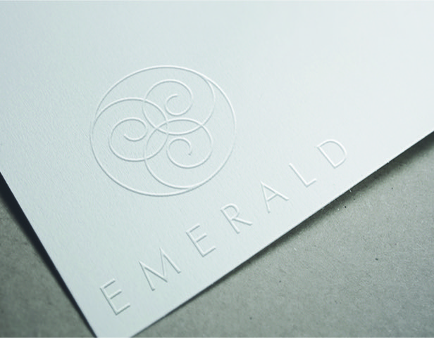
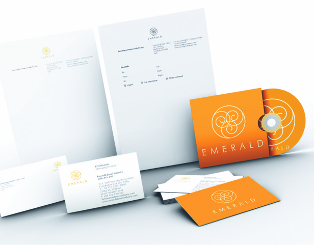
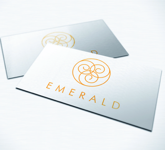
Corporate identity and branding helped Asia’s largest jewellery manufacturer retain its position on the top of its ladder – the mark was an elegant, typographical arrangement that comprised of three lower case forms of ‘e’ in a dynamic movement, which connoted elegance, balance, progress and harmony.
Services rendered
Corporate Brand Identity
Identity Standardisation
Category
Corporate Identity