
Kiddoh
Kiddoh
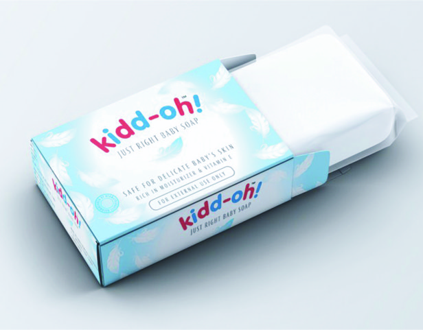
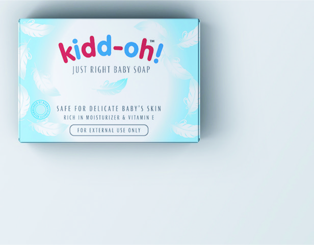
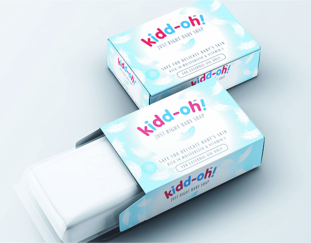
The visual identity developed for a tiny tots’ soap had a big impact – the branding and packaging created embodied the feelings of softness, sensitivity, and tender loving care. The brand logo and brand colours, inclusive of the colour palette, were carefully selected to achieve the desired visual semantics. With the advent of the new packaging and brand identity, Kiddoh entered the targeted markets with ease, achieving its business objectives at an accelerated pace.
Services rendered
Naming
Brand Identity
Brochures
Marketing collateral
Packaging
Category
Packaging