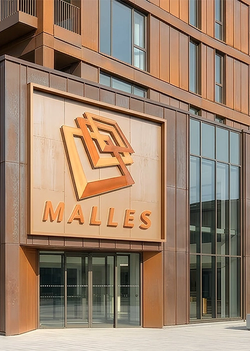
A leading Chennai-based construction company with over fifty years of excellence required a contemporary corporate identity that would reflect its leadership position while honouring its rich legacy. The objective was to modernise the brand without losing the trust, credibility, and goodwill built over decades. The new identity needed to communicate strength, reliability, architectural excellence, and progressive thinking while appealing to a new generation of customers and investors.
The rebranding process began with an in-depth study of the company’s history, business philosophy, market positioning, and long-term vision. Extensive analysis of the real estate sector and competing brands identified opportunities to create a distinctive identity built on simplicity, timelessness, and structural precision. Multiple design concepts were explored before arriving at a refined visual language that symbolised stability, growth, and enduring value while remaining versatile across every corporate application.
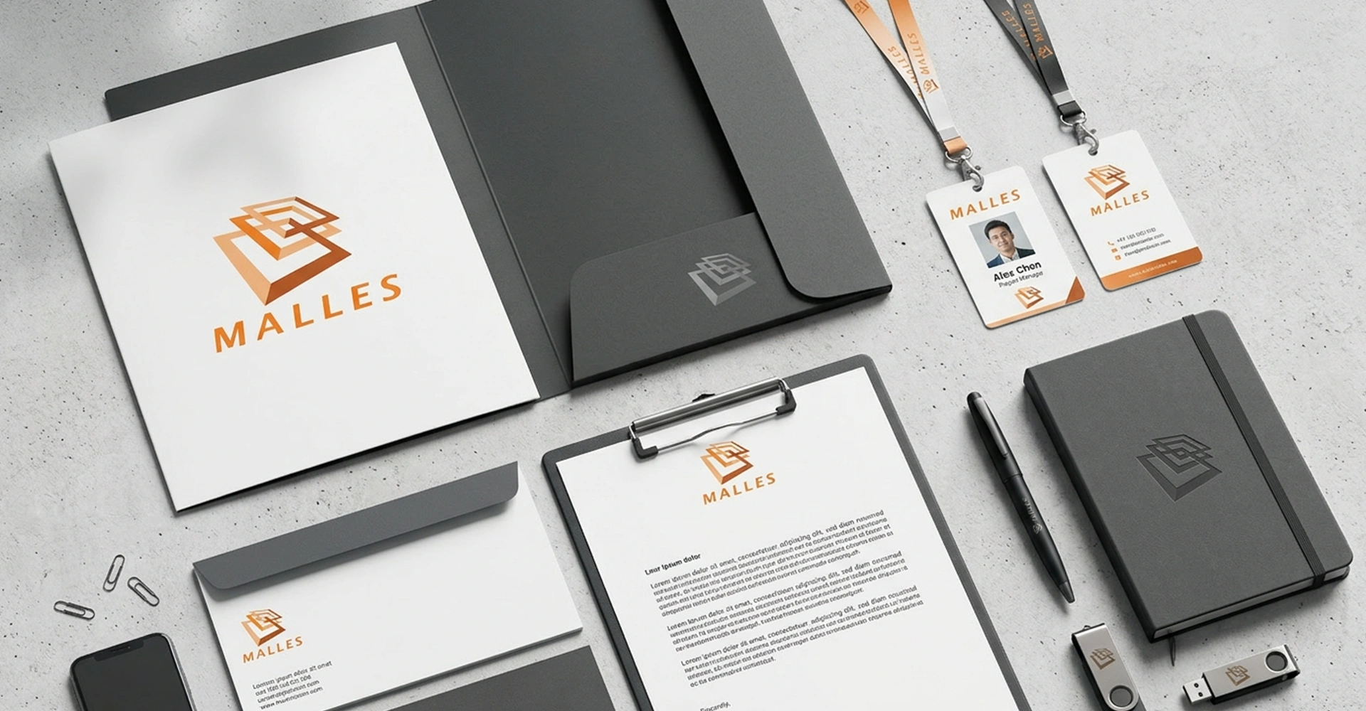
The selected identity was meticulously refined through balanced geometry, contemporary typography, and a sophisticated colour palette. A comprehensive corporate identity system was created for use across project branding, corporate communications, marketing collateral, digital platforms, signage, and environmental graphics, ensuring complete consistency throughout the organisation.
The revitalised identity successfully transformed market perception while preserving the company’s heritage. Its contemporary yet timeless design strengthened brand credibility, enhanced visibility, and reinforced the organisation’s position as one of Chennai’s most respected real estate conglomerates. Today, the identity continues to support business growth, inspire stakeholder confidence, and serve as a powerful symbol of quality, trust, and long-term leadership.