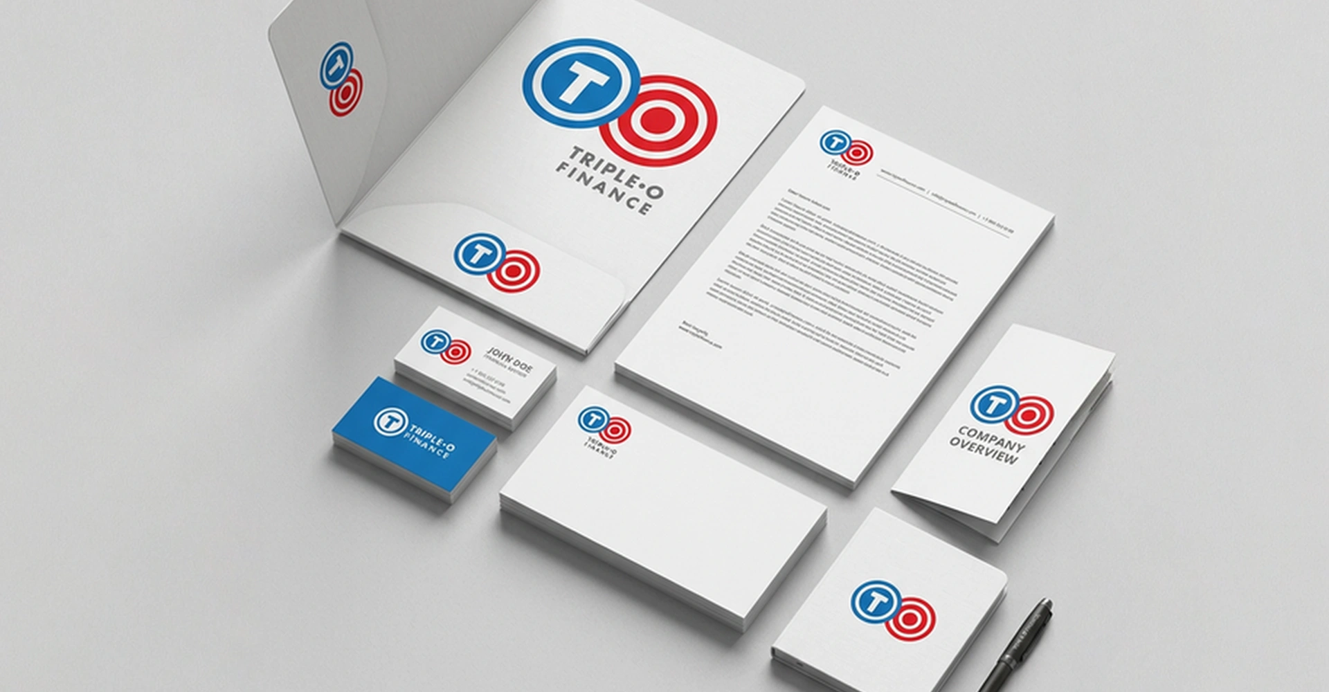
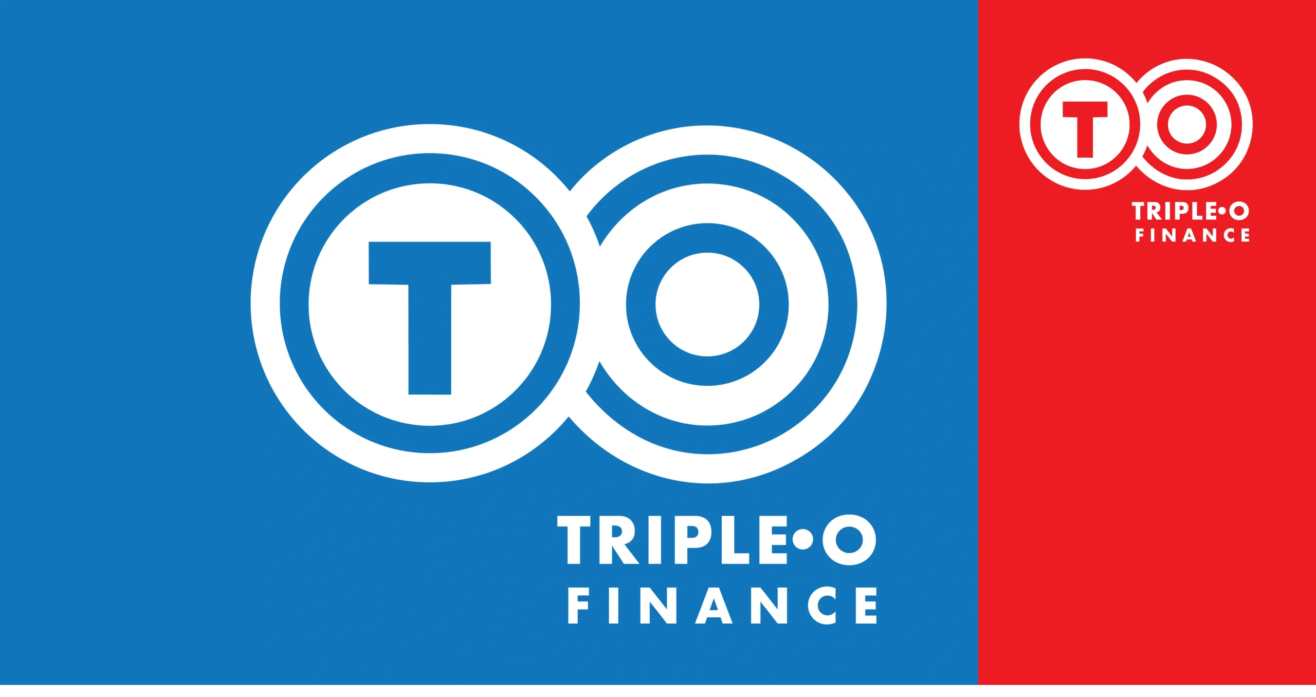
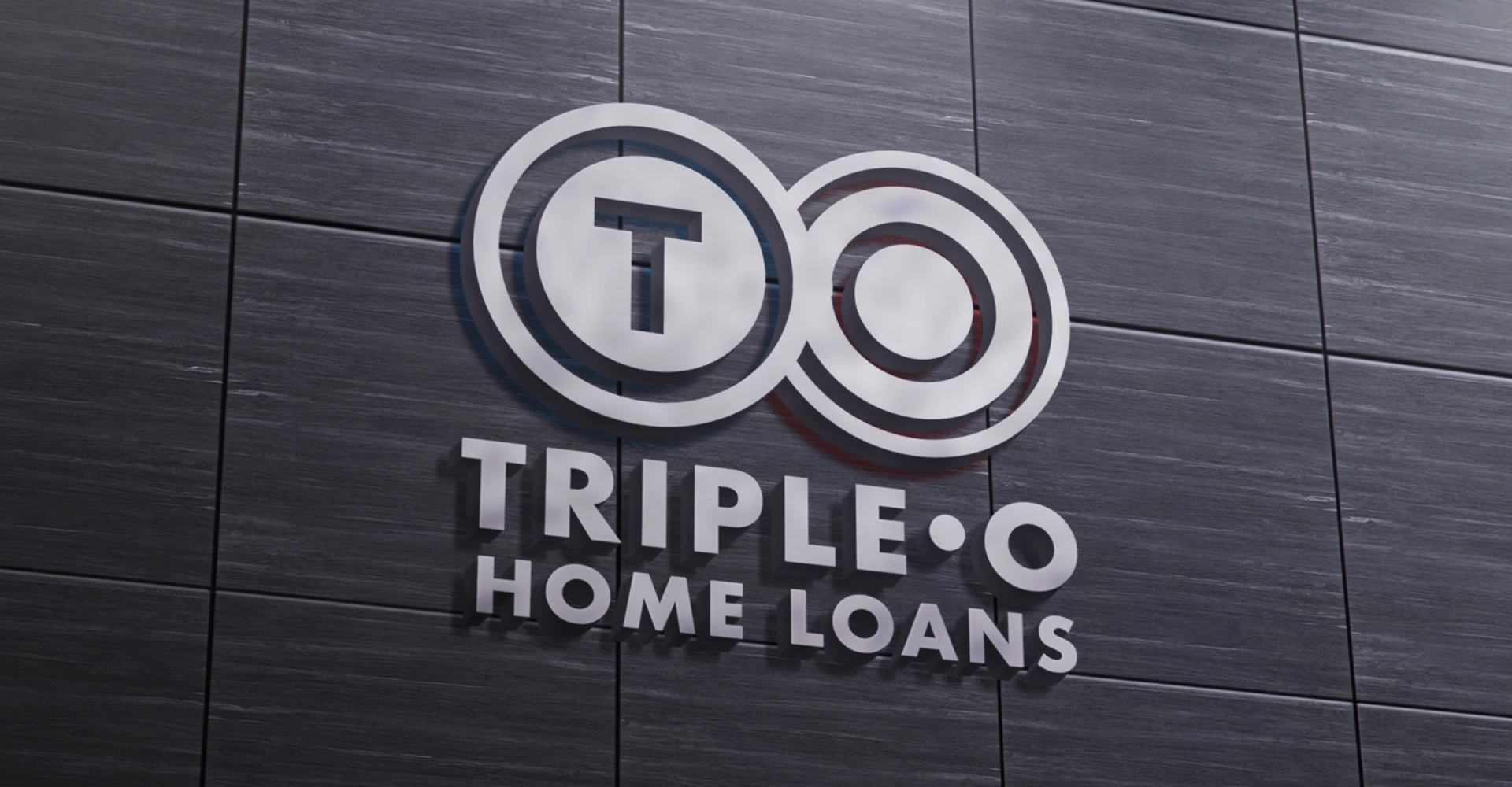
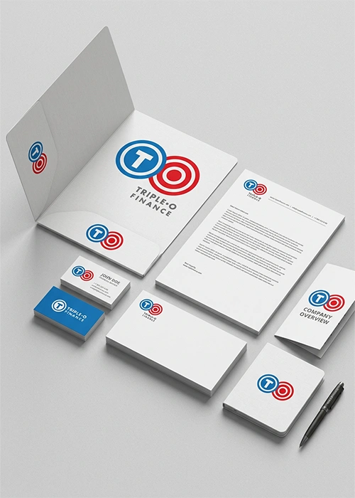
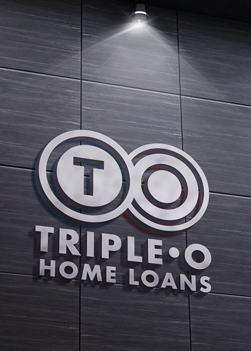
Triple O provides police officers, doctors, nurses, and other emergency services professionals with efficient access to home and car loans. The brand identity fuses two circular forms into a distinctive and memorable composition. The first form incorporates the letter ‘T’ from ‘Triple,’ while the second integrates the three ‘O’s, creating a visually engaging and conceptually rich symbol that serves as a mnemonic device. The colour palette enhances emotional connection and reinforces brand meaning. A hue from the police force colour spectrum conveys energy, passion, compassion, and vitality. Oceanic Blue represents the brand’s humane qualities, symbolising care, assurance, stability, and dependability. Steel Grey, as a supporting colour, underscores trust, promise, and commitment. Together, the identity system establishes a brand presence that is distinctive, credible, contemporary, and emotionally resonant, aligning with Triple O’s mission and service ethos.